2025 HRSouthwest Conference
Branding/Style Guide
Year
2024
Completed For

Developed with
What Was
The Objective
To reimagine and elevate the branding for the 2025 HRSouthwest Conference, focusing on creating a refreshed, vibrant, and cohesive identity that resonates with HR professionals and industry leaders alike.
Make It The Same,
But Different
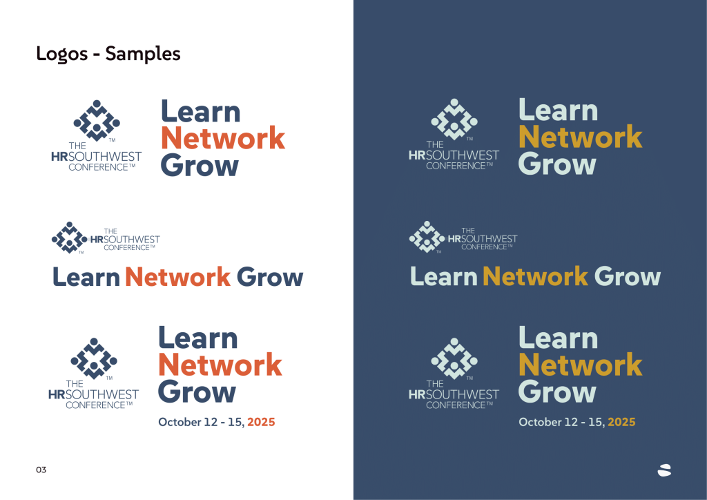
The primary guidance from the client for this project was their desire to incorporate the same arrow motifs as before, but use dotted lines, as opposed to solid lines. For the rest—including colors, fonts, and overall style—I had full creative discretion.
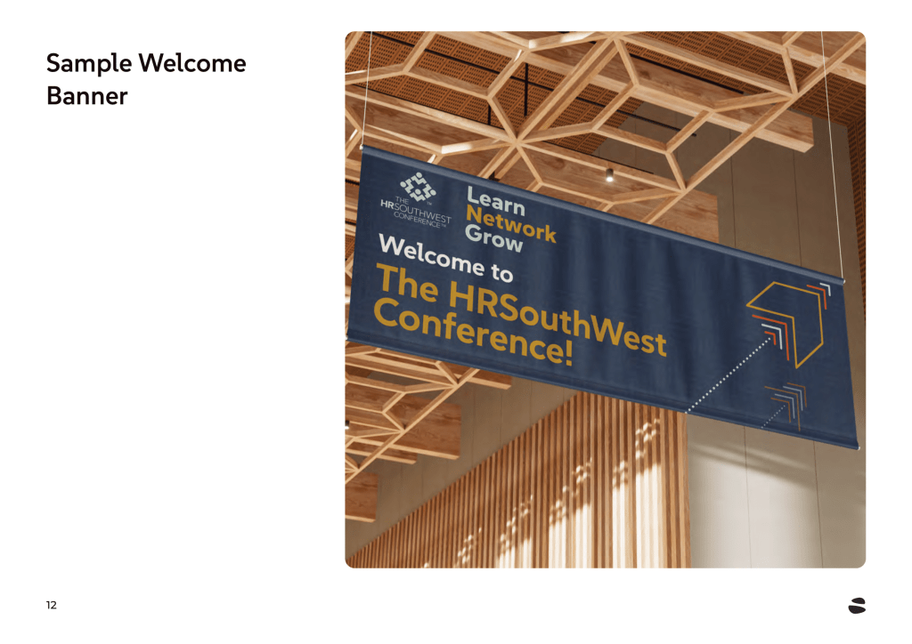
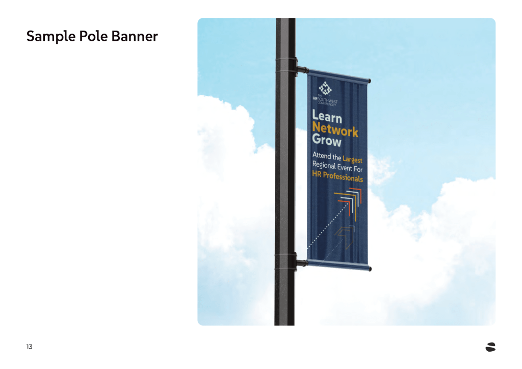
Having worked with this client since I joined Streampoint Solutions in 2016, I had a strong understanding of their style and preferences. I assembled a color palette and selected a font that I knew would resonate with their brand. To convey a sense of progress and growth, I adjusted the arrow motifs to a 45-degree angle. The client loved it.
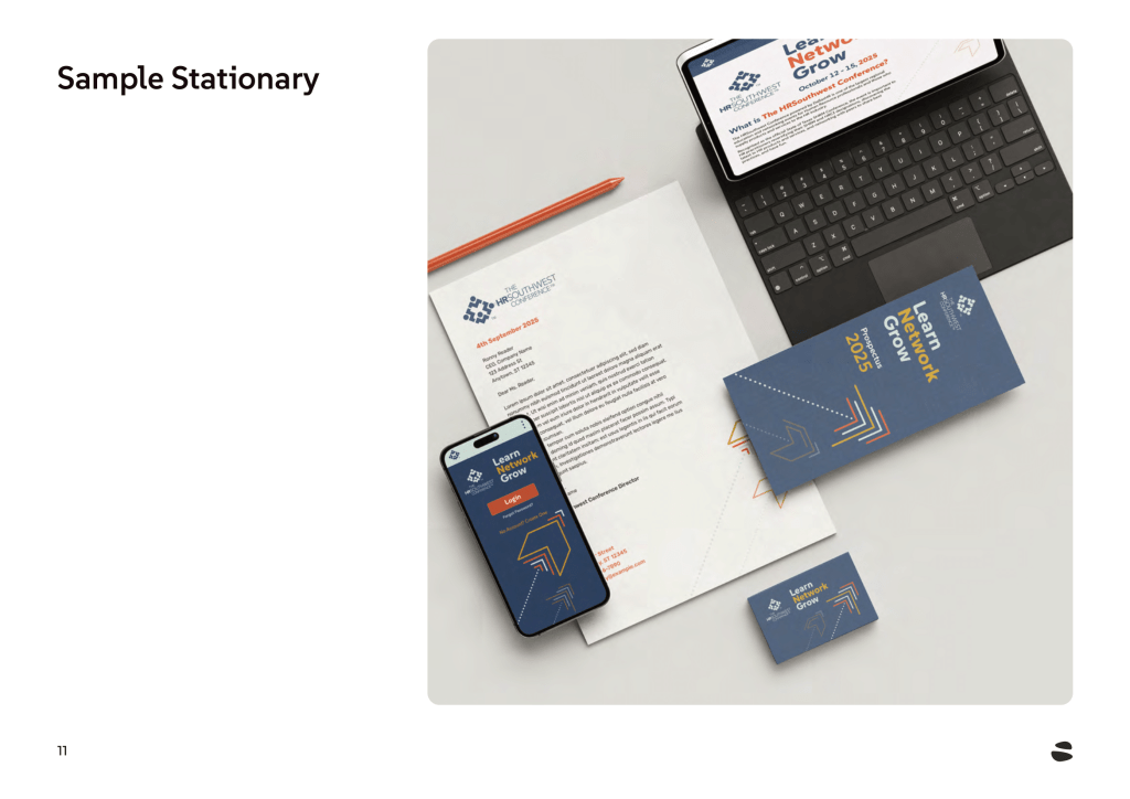
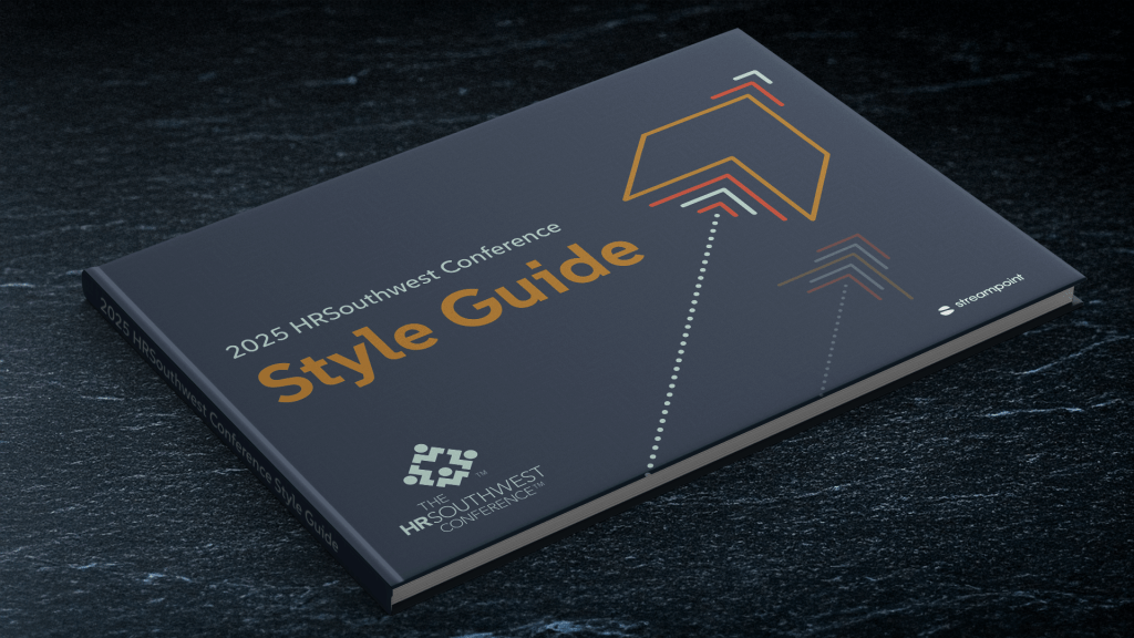
With these elements in place, I created key mockups to showcase the direction this branding could take and developed a fresh style guide, all in time for their 2024 conference.
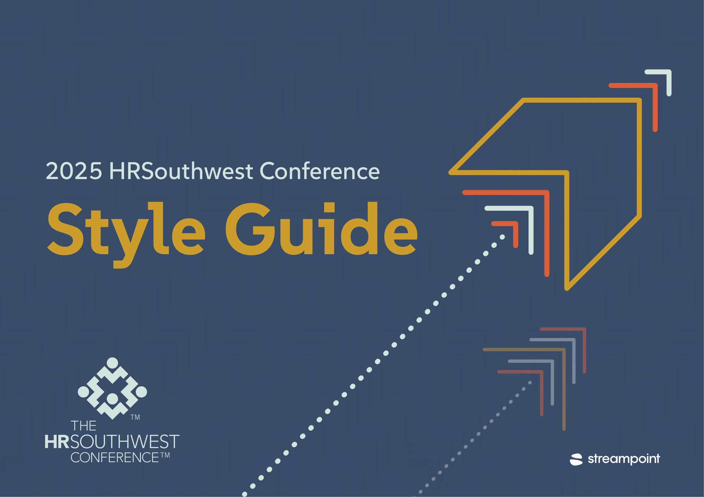
2024 and 2025 Style Guide Comparison
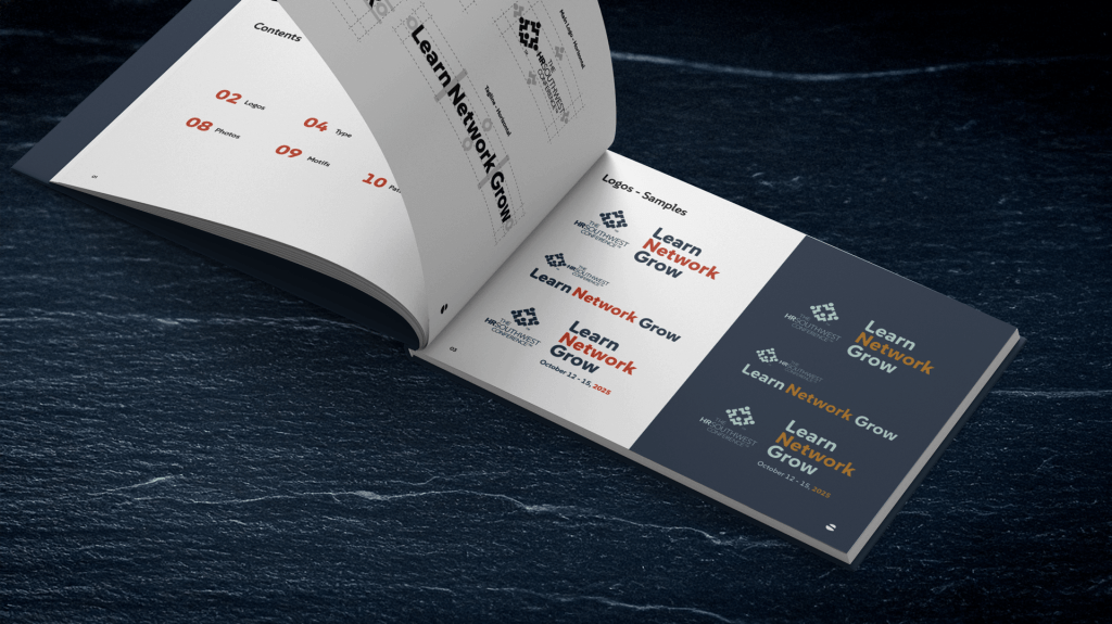
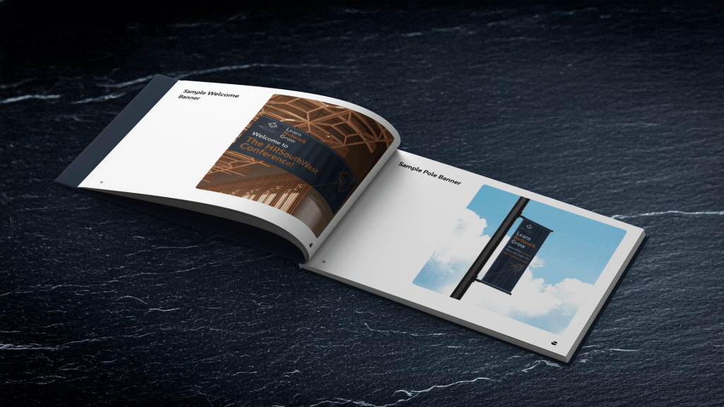
A Few
Page Examples